A Step-by-Step Guide to Build a Memorable Colour Palette
So, you’re ready to create your own brand colour palette, huh? Woohoo!
Welcome to Part 2 of 2 for my “What Does Your Colour Palette Say About Your Brand?” blog series, where I’m going to be taking you through the step by step process of how to create your own memorable colour palette for your brand.
If you missed Part 1 which delved deep into the psychology of colour (and how simply choosing colours you like can make or break a prospect’s decision to work with you), I highly recommend you read that blog post first (click here to head there now).
If you’re a superstar and you’ve already read Part 1, let’s dive into my exact process – that I take my own wonderful branding clients through – to create a colour palette that truly represents what your brand stands for.
COLOUR SCHEMES
Once you have identified your brand’s personality, who your Ideal Client is, and what colours represent your brand best, it’s time to decide how you’re going to mix and match your colours to create a full brand palette.
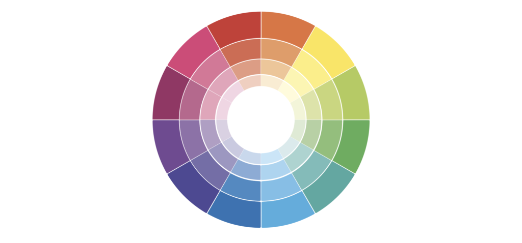
If you haven’t heard of the Color Wheel before, in a nutshell, it’s a visual representation of colours arranged in a circle based on their chromatic relationship. But, I’m not gonna confuse you with all the technical lingo…
What you need to know is that there are four main colour combinations that designers refer to:
- Monochromatic
- Analogous
- Complementary
- Triadic
And it’s up to you which one you wanna use for your brand. Below, I’m going through all three colour schemes with examples and tips on how to sue them. (Pssst, if you’re more of a gimme-a-tool-to-do-it, don’t worry because I’m going to share a reeeeally cool tool with you at the end of this post. But no skipping ahead! Kay?)
Here we go:
Monochromatic Colour Scheme
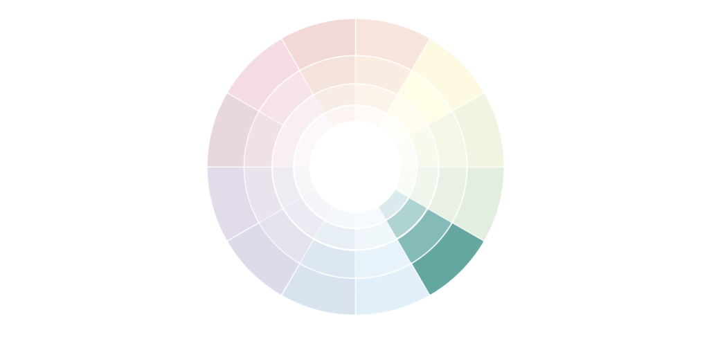
What is it?
Monochromatic colours are a combination of a colour’s hues and tints
What is it best for?
You will end up with a consistent look & feel
How does it work?
Sometimes such colour schemes end up being a little bland and boring, so I always suggest adding a little accent colour to add more personality to your brand.
Don’t forget to also use light and dark colours to have variety and ensure there’s balance in your colour palette.

Analogous Colour Scheme

What is it?
Analogous colours are colours that sit next to each other on the colour wheel.
What is it best for?
These colours usually end up belonging to the same family and the result is a varied, but nicely balanced colour palette.
How does it work?
Similar to a monochromatic colour scheme, you may want to consider adding an accent colour to add some pizzazz to your brand. You can even try adding a cool accent colour for an even more dramatic effect.

Complementary Colour Scheme
What is it?
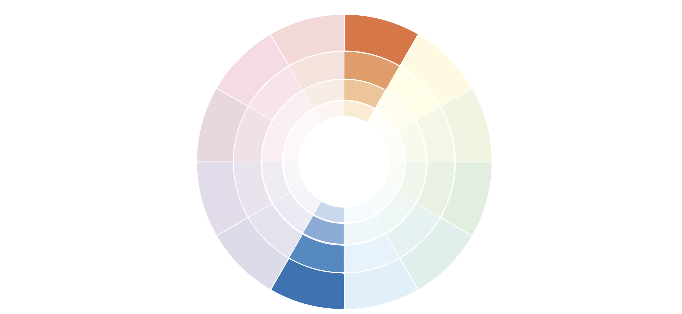
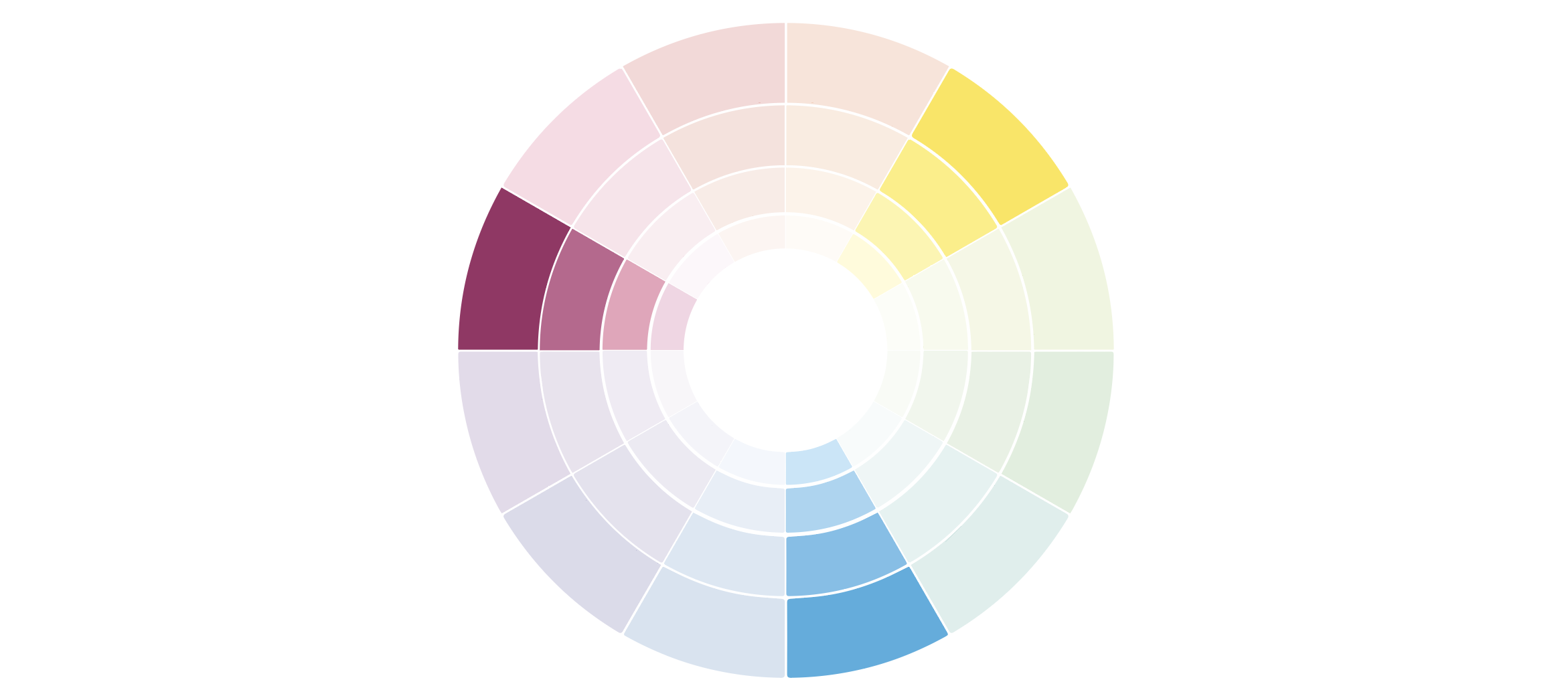
Complementary colour schemes use colours that sit opposite of each other on the colour wheel and have a balance of warm and cool colours.
(I personally loooove playing around with complementary colour palettes, but be careful not to fall into the common colour overload when choosing this combination).
What is it best for?
Remember, when it comes to colour combos – less is more. It’s best to focus on 2 vibrant colours from both ends of the wheel and complete your palettes with a variety of hues and tints.
How does it work?
From the example below you can see how the same palette can look completely differently when simply adjusting the colours’ tone, hue and tint.

Triadic Colour Scheme
What is it?
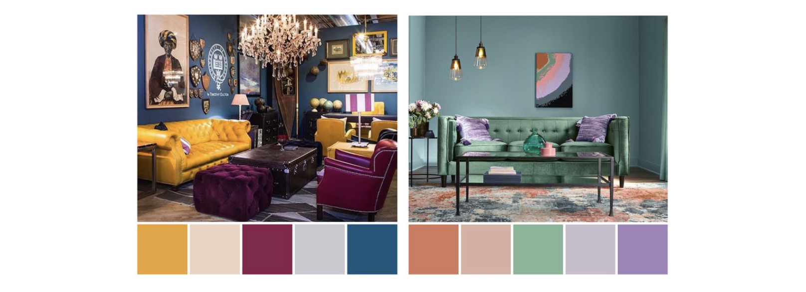
A triadic colour palette is made up of three colours that are equally spaced out on the colour wheel.
What is it best for?
This combination is often used not only in branding, but also interior design and fashion to create a harmonious result that truly stands out.
How does it work?
See the example below:
Okay, so those are the 4 types of colour combinations – now it’s time to help you create your own!
HOW TO CREATE YOUR COLOUR PALETTE
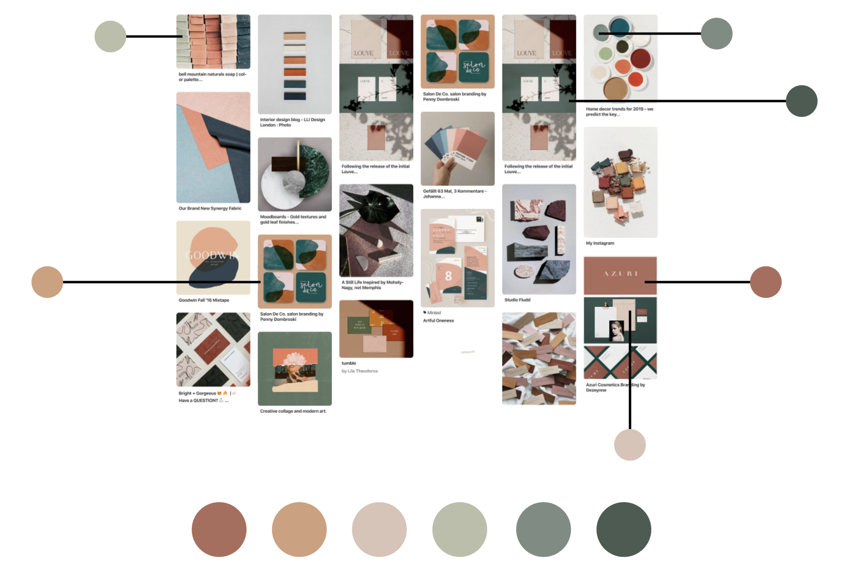
STEP 1: Create a Pinterest Inspiration Board
In Part 1 of this colour palette series, I already expressed my love for Pinterest! Now, we’re gonna use it to create a moodboard of images that visually represent your brand. This can be anything that is aligned with your vision of your brand.
For example, here’s a moodboard for a project I’m currently working on. Based on these images, can you guess which colour scheme I’m going for?
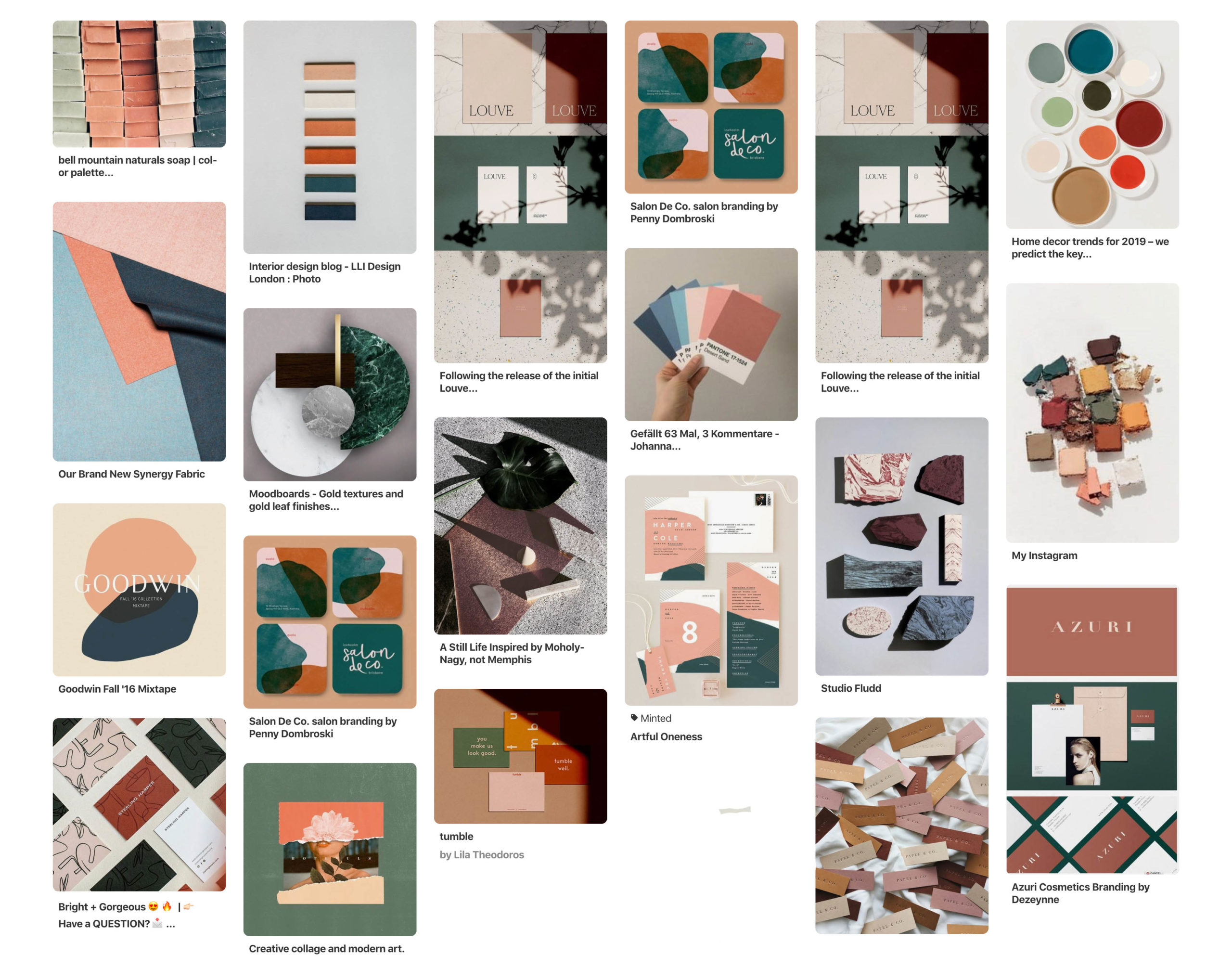
If you answered complementary, then you’re absolutely right! Based on this moodboard, you can see a clear dominance of blood orange and nature’s green, which sit opposite of each other on the colour wheel.
STEP 2: Pull dominant colours
Once you’ve gathered 30-50 pins, have a look at what colours dominate in your moodboard and pull 6 colours from your images. If you don’t have a design program, you can use a helpful Chrome extension, ColorZilla, that allows you to colour pick HEX codes right from your browser!
STEP 3: Adjust & Perfect
If you’ve done everything right, at the end of Step 2, you end up with a beautiful, balanced colour palette that is almost good to go! But now it’s time to adjust it so it can fit your brand perfectly.
This means adjusting the colours tints and hues, adding vibrance or maybe even an accent colour, if you want. Most importantly, never lose sight of what your brand stands for and who your ideal client is!
For example, for the brand I showed above, we wanted to add more femininity and vibrance to the colour palette, so it corresponds better to our Ideal Client. And here is what we ended up with this:

STEP 4: Confirm
Once you found your perfect combination of colours, before finalising it, make sure to go back to your initial brand research and ask yourself the following questions:
- What emotions do these colours trigger?
- Do they represent my brand personality, purpose and values?
- Will these colours appeal to my Ideal Client?
If you want to take it a step further, I suggest showing these colours to a couple of people (even better if they fit your Ideal Client Avatar!) and ask them the following questions:
- How do these colours make you feel?
- What type of brand/service/product do you associate these colours with?
- If I told you these were the colours for X (your brand), what thoughts/emotions come to mind?
And that’s it! That’s how you create a strong, cohesive, intentional colour palette that perfectly represents your brand’s values and purpose.
EXTRA TIPS
Now, before I let you dive into the creation of your own colour palette, here are some extra tips for you:
- You don’t need 6 colours in your colour palette. In fact, 6 colours is the maximum amount that I would recommend for a brand. But it’s totally okay to just have 2 or 3 colours too! Just make sure that they reflect your brand properly and appeal to your Ideal Client.
- You can have a black and white colour palette. That’s okay too! But if you’re going for a minimal black and white look, consider adding an accept colours (which doesn’t particularly need to be super vibrant) to add a touch of personality to your brand.
- Create a document with all your colours codes on hand. Create a document with your RGB, CMYK and HEX codes for your colour scheme and keep it somewhere where you can easily access it. You can use ConvertAColour to easily convert your HEX values into RGB and CMYK.
- And finally, the is the handy tool I told you about…is THIS! This “made-in-college” online colour wheel helps create a colour palette based on your choice of base colour. Play around to see which colour scheme will work best for your brand. I personally love to use it as an inspiration and then will adjust the colours separately until I find a palette that truly hits the spot!
And tadaaaaaaaaa! You now have everything you need to design and create a b-e-a-utiful colour palette that showcases your brand in all of it’s rightful glory.
I hope you enjoyed this 2 Part Colour Palette blog series, friend!
If you did find this super helpful, I would love and appreciate it if you shared this with your friends and fellow entrepreneurs who would benefit from this too! Got any requests for future blog content or questions about this series? Let me know over on Instagram @One6Creative! (That’s where I hang out the most!)

